Retail experience

Less friction.
More flow.
Checkout, back office and insights in one connected experience, designed around the people behind the counter.
Explore the case study ↓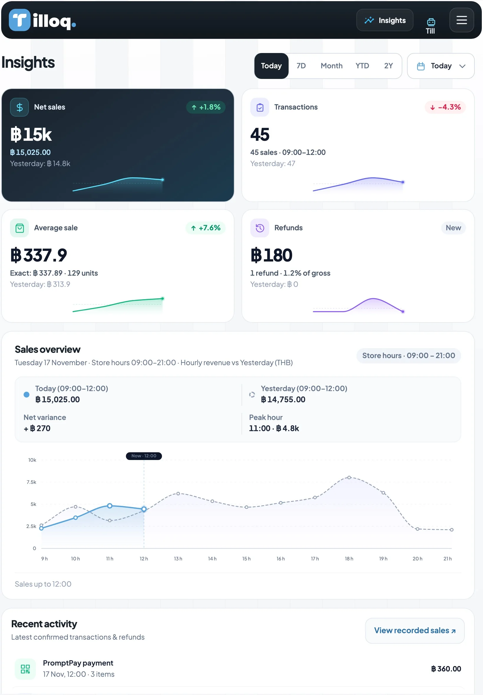
Checkout, back office and insights in one connected experience, designed around the people behind the counter.
Explore the case study ↓A cashier needs to keep the line moving. A store owner needs to know what is running out. Tilloq brings these everyday decisions into one coherent experience.
Sole designer on the project, alongside a PM, two developers and a QA. I led the desk research, information architecture, user flows, wireframes, UI, the brand identity including the logo, and the interactive prototype tested on iPad.
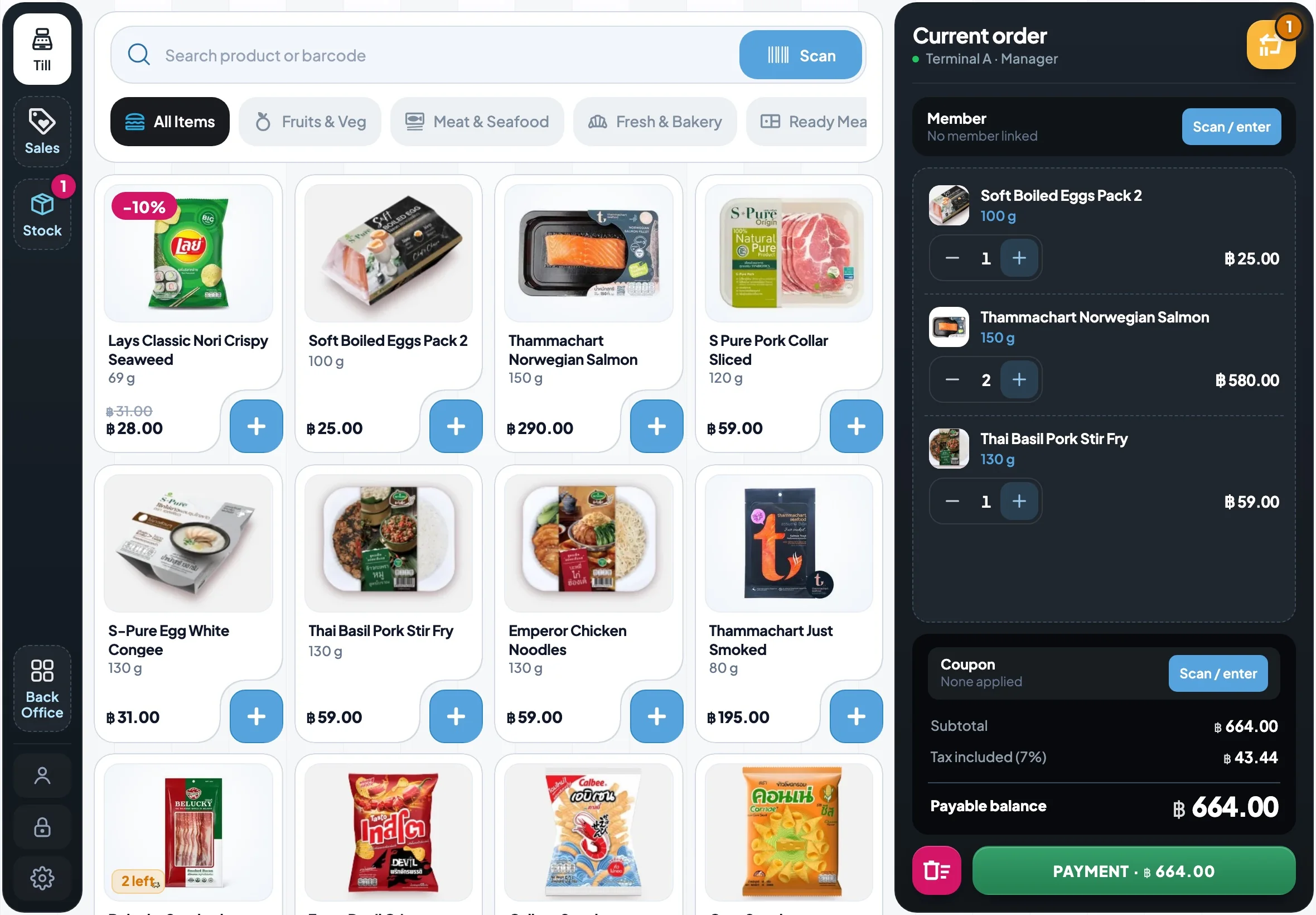
The search bar and the scanner sit at the top, always in the same place. A few letters are usually enough.
For loose items without a barcode, one row of categories narrows the grid without opening a menu.
Large cards, a 48 px add button, price and weight readable at arm's length.
The order stays on the right during the whole sale — including payment — so the cashier can correct it at any time.


At the payment step the cashier needs one answer: how much to give back. Everything else steps aside.

Banknote shortcuts fill the amount in one tap; the change is computed and shown in green before the cashier opens the drawer.
Receipt, drawer, next customer.
Clear reason, the basket is kept, try another method.
Network lost mid-payment. Tilloq checks before allowing a retry, so a customer is never charged twice.
After the queue, the same app runs the shop: what to reorder, what arrived, and whether the cash drawer is right.
A reorder proposal from sales and lead times — and “Nothing to order” when stock already covers demand.
Orders, late deliveries and partial receipts on one working page.
The cashier counts without seeing the expected amount, so the count is never adjusted to match.
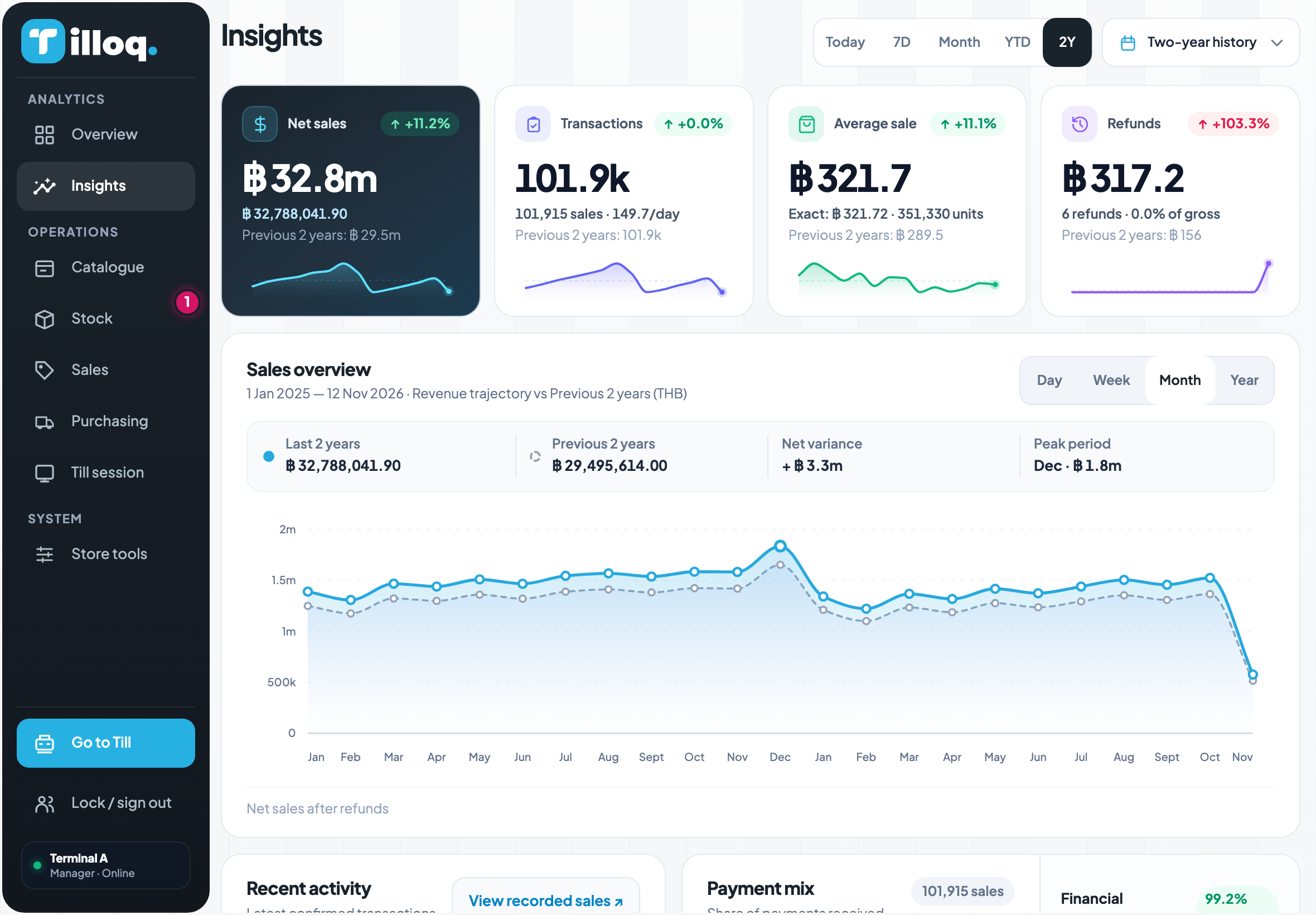
Fewer charts, each one answering a question. Figures from the prototype's two-year sales simulation.
Tilloq rests on a few rules set once. Every new screen reuses them instead of reinventing them: the till, the back office and the insights speak the same language.
#34A06A#57A3DD#D41466#F9B83C#7D60BB#1C232BA colour never changes meaning from one screen to the next. You read the action before the word.
Latest confirmed sales
The button sits in a corner cut out of the card instead of covering it. One rule everywhere: only the button width changes.
Everywhere else Tilloq is flat: a border marks a state, never a shadow. On the Cash screen, notes and keys get depth so they can be hit without searching.
Try it: every button sinks when pressed; a disabled button never moves.
A price is never smaller than its name. The ฿ is set at 0.72 em so the figure leads.
The product comes first on this page. Here is the path behind it, in three steps.
A queue forms in front of the cashier. Every hesitation, every wrong tap and every recount happens in front of a customer.
Standing, one hand on the scanner, a customer waiting.
Opens and closes the till, approves refunds, receives deliveries.
Looks at the shop from a distance, once a day.
Based on desk research and product framing with the PM — no field interviews yet.
The till is built for speed; the Back Office for decisions. Both share the same products, stock and sales — the cashier never has to leave the sale to answer a question.
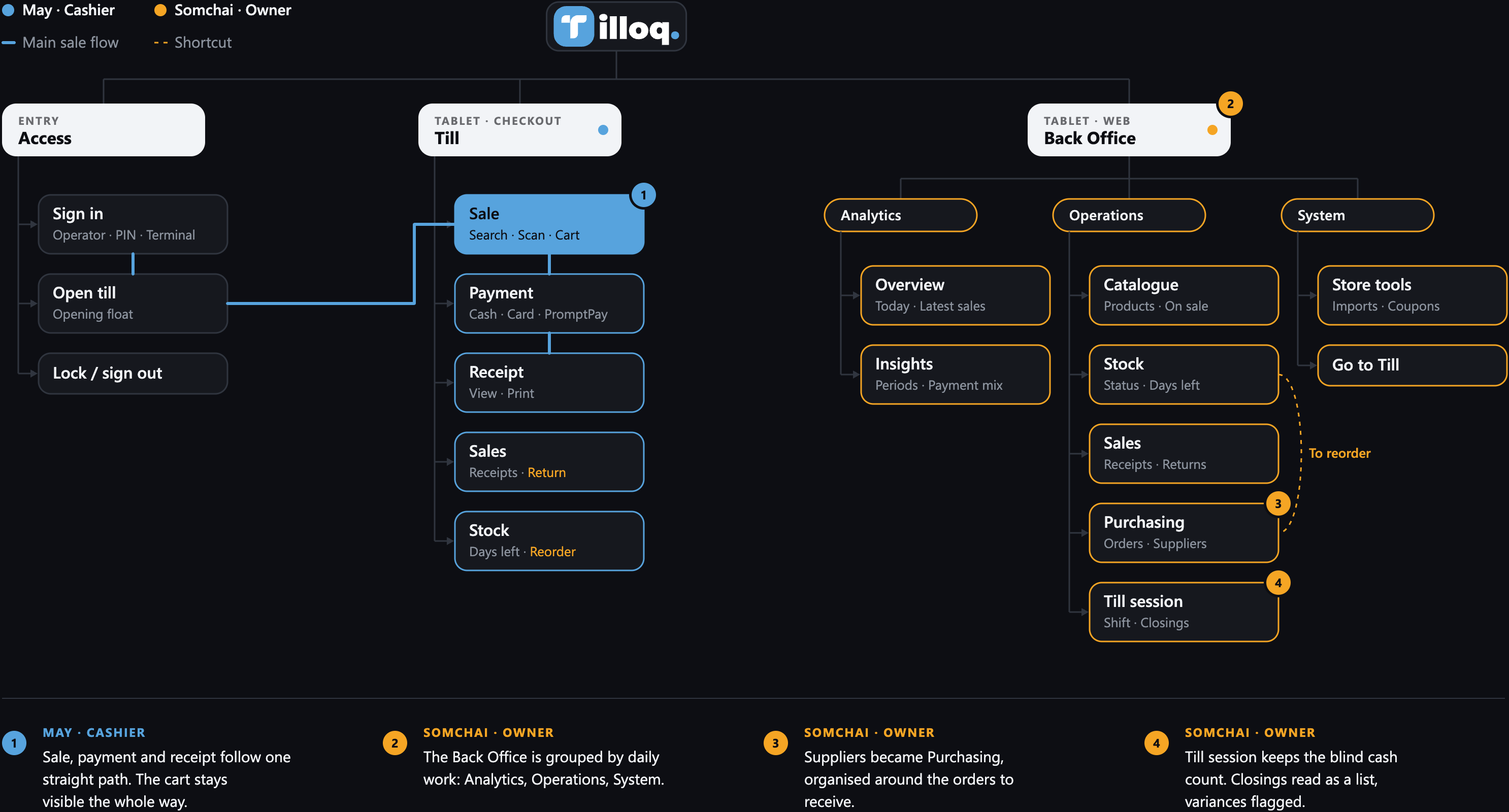

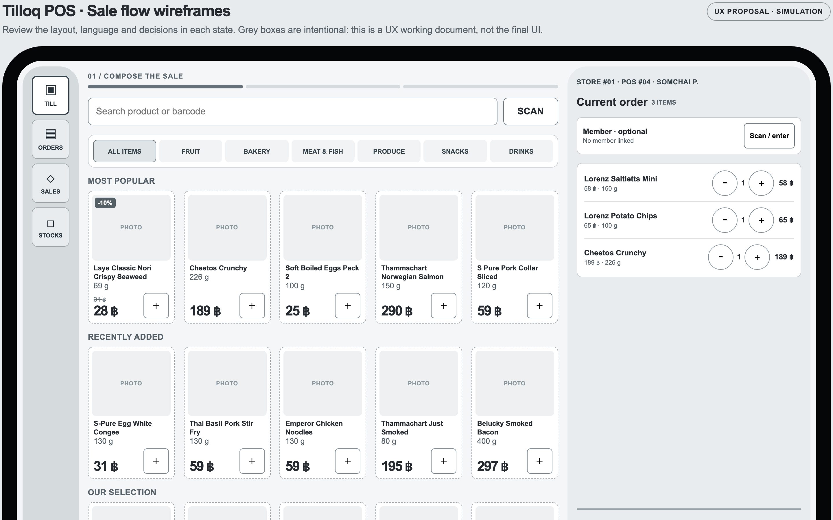
The structure was settled in wireframes before any colour. Drag to compare the sale screen at both ends of the process.

Nothing is measured in a real shop yet. These are the targets set for the first in-store test.
for a three-item cash sale, from first scan to change given
double charge when a card result is unknown
minimum ease rating given by cashiers after a shift